
 |
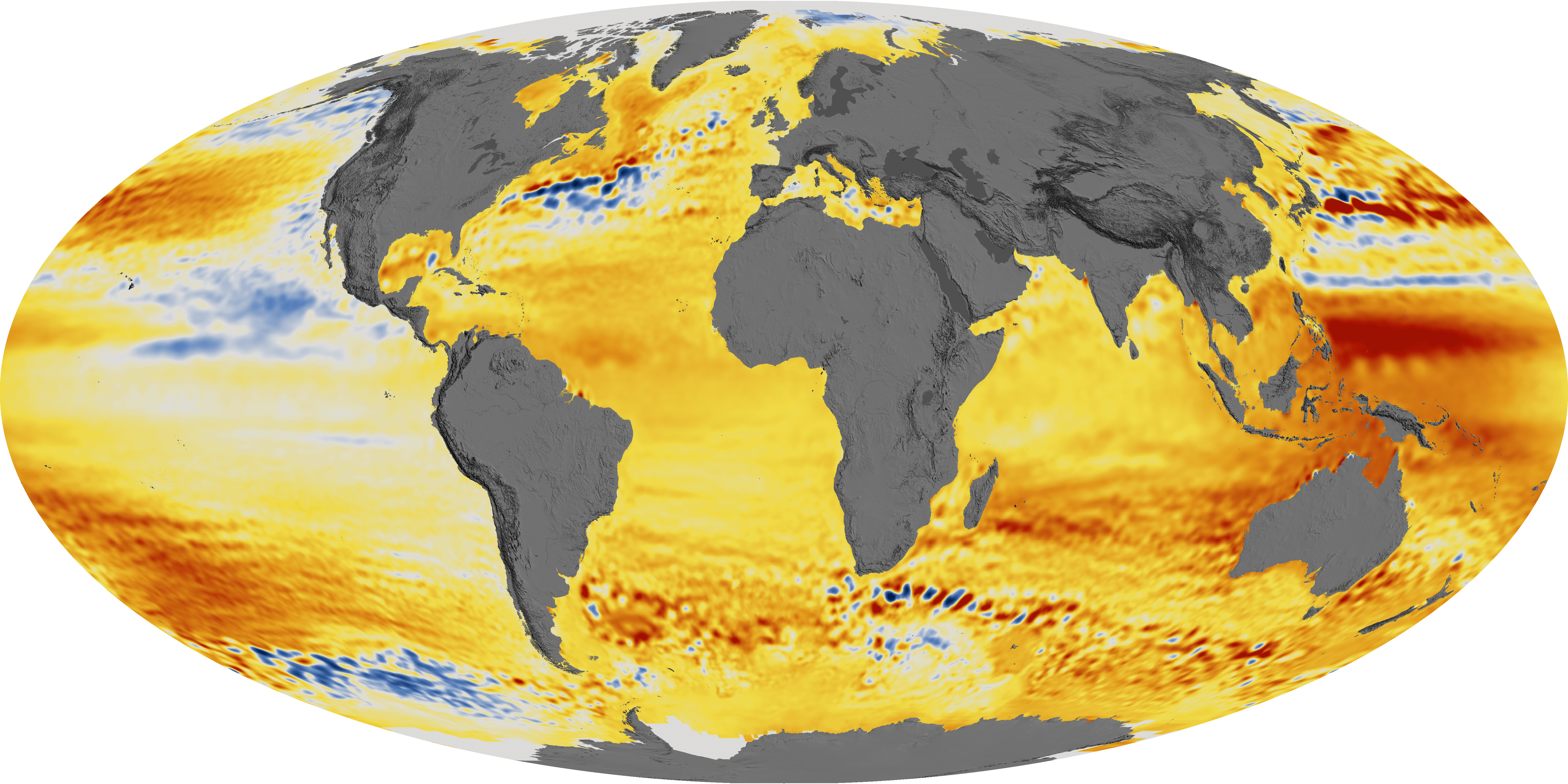
| World Map of Sea Level Change |
Okay, there's a few caveats. First up, it's the ocean. You ever seen the ocean? It isn't flat, it's a heaving, sloshing beast. Measuring the 'average' sea level is a bit of trick. Basically it means taking a whole bunch of measurements and averaging them out. And don't forget the tides which force big changes twice a day.
I suspect that the reason this history only goes back 22 years is that is how long we have had a satellite that could make these measurements. Still, I'm wondering what could be causing the water level to be lower anywhere at all, and the only thing I can think of is air pressure. 14 centimeters (the distance from 7 cm below to 7cm above) is about 6 inches. Atmospheric pressure at sea level is roughly 15 PSI, which equates to roughly 30 feet of water, or one-half pound per foot. So at a depth of 6 inches, water pressure will be about one-quarter of a pound, or four ounces.
Atmospheric pressure goes up and down, that's what the weatherman is always babbling about, but I've never bothered to figure out how much the change was in any kind of real terms. Now I go looking for the normal variation in air pressure and I am getting everything but, until I come across Amanda's explanation:
The normal range of the Earth's air pressure is from 980 millibars (mb) to 1050 mb.OK a millibar is one one-thousandth of a bar, and one bar might be a measure of the standard air pressure. The important part is that the numbers tell us that air pressure varies between being 2% low and 5% high. Normal air pressure will support a column of water approximately 30 feet high. 7% of 30 feet is roughly two feet, which is four times as much as what we are seeing in the above map. So the depressions (lower sea levels) we are seeing in the above map could be due to a persistent area of very slightly higher pressure.
We might conclude that global warming is causing these low pressure areas in the Eastern Pacific as well as some high pressure areas in the Western Pacific, but don't get too attached to that notion. There is liable to be some new Star Trek grade revelation next week that will upset the whole apple cart and we'll be inundated with a whole new batch of fancy graphics.
On a related note, NASA has an article on Global Warming that was not written for preschoolers AND seems to be relatively free of politcal pontificating, so it's doubly exceptional.
Via Detroit Steve
Update 2 days later - revised the paragraph relating air pressure to sea levels.


No comments:
Post a Comment