Intel's Ronler Acres Plant

Silicon Forest
If the type is too small, Ctrl+ is your friend

Showing posts with label graphics. Show all posts

Monday, November 11, 2024

More Joy


Love Will Tear Us Apart - Joy Division
That One Sound

'Joy Division eh? What's all that about?'
'The name of a brothel German soldiers used during the second world war'. 

WHAT!?! Umm, yeah, Wikipedia knows:

In World War II, Nazi Germany established brothels in the concentration camps (Lagerbordell or Freudenabteilungen "Joy Divisions") to increase productivity among inmates. Their use was restricted to the more privileged Aryan prisoners, primarily the Kapos, or "prisoner functionaries", and the criminal element. Jewish inmates were prohibited from using the brothels according to rules against racial mixing. In the end, the camp brothels did not produce any noticeable increase in the prisoners' productivity levels but, instead, created a market for coupons among the more privileged camp prisoners.

The women forced into these brothels came mainly from the women-only Ravensbrück concentration camp, except for Auschwitz, which used its own prisoners. In combination with the German military brothels in World War II, it is estimated that at least 34,140 female inmates were forced into sexual slavery during the Third Reich.

Ka-tzetnik 135633 wrote a book (House of Dolls) about it.

******

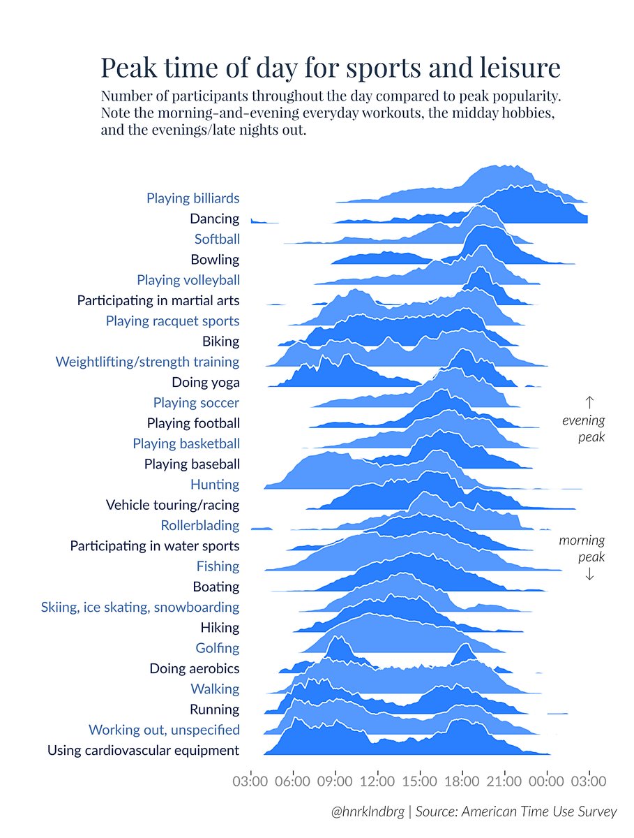
Then I found this post about Joy Plots:

Let’s talk about plots and joy. The Joy of Plots, if you will. Also, Joy Plots.
Henrik Lindberg coined the term Joy Plot on the weekend , and it’s quite clever. Not only does it describe a plot of things people enjoy, it’s also a nice reference to that Joy Division album cover everybody knows even if they’ve never heard the actual music.

Thursday, September 12, 2024

Fun with Math

United States of Voronoi

California Bob reports:

I just learned about this. This is one of those things that's easy to see but difficult to describe.

Voronoi Cells

A Voronoi diagram partitions a plane around points or "seeds" within it.  It THINK it divides the area so that the boundaries are always halfway between one seed and the next closest seed.

The official description is, boundaries are drawn so that all points within that boundary, are closer to its seed, than to any other seed.

If each seed was a repelling magnet, would this describe the same boundaries?

Here [image at top] it's used to draw state boundaries around state capitals.

Saturday, July 17, 2021

Coordinates


Y Axis Charlatans

Stole this graph from Joseph Moore over on Yard Sale of the Mind. A distorted Y-Axis is one thing that is guaran-damn-teed to set me off, so I am very pleased to find someone who agrees with me. 

Joseph has a few things to say about the statistics of death. Coincidentally, I had something to say about it yesterday. Realized later that perhaps I should have included gun deaths in my comparison. They are in the same range. Oh well, maybe later.

Meanwhile, back at the ranch, I have got my puzzle solving program completed. I mention it here because I am using the X & Y coordinates to locate the puzzle pieces in the playing field. Well, the program is 'complete', but there is a bug in there somewhere, so it is not actually able to solve the puzzle. All the little bits and pieces seem to work just fine, but there is still something very wrong, I just can't see it.

Meanwhile, also at the ranch, our internet connection died yesterday morning. It's back now, but it still seems to be a bit crippled. Earlier this morning I couldn't reach most websites including gmail and this one. When feedly came back, I found a post on Schneier on Security that claimed the big ransomware evil doers were down and out. Heck of a coincidence that they go down and MY internet goes down at the same time. What if the ransomware dudes decided to skip the small fry and just fuck the entire internet? I suspect it wasn't malicious, it was just typical sloppy, commercial business operations. The one guy who was keeping the stack of server farms from turning into a cluster fuck took the day off and all the other nitwits were in meeting about some kind of panty-waist chickshit. i.e. nobody was watching the fucking store. Or it might have been a guy with a backhoe.


Saturday, February 8, 2020

BLACK TEXT MATTERS

I don't know what is wrong with some web page designers. Maybe they're racists. Maybe they want all colors to blend together. White backgrounds are becoming less white and black text is becoming less black and more gray. If they have their way eventually if will all blend into a gray fog and you will have to imagine what the text says. Of course, some people apply their own filters to whatever they read. You may as well run the text through a blender before you give it to them. They are going to twist it to their own purposes regardless.

Never-the-less, anytime I come across a page with gray text, I fire off a nasty gram telling these nincompoops to get their act together. Use BLACK not gray for text.

Sunday, February 18, 2018

Map of Stable Isotopes

Cool graph of the day.
Map of stable isotopes
The number of protons in an atom's nucleus determine what element it is, i.e. hydrogen, iron, oxygen, etc. The Z axis along the bottom on the graph indicates the number of protons.

The number of neutrons in an atom's nucleus determine what isotope you have of any particular element. The N axis along the left side of the graph indicates the number of neutrons.

Each colored dot plotted in the above graph represents a particular isotope of a particular element. 
Isotopes have different degrees of stability as measured by their half-life. This is indicated by the color of the dot. The key for the colors is listed in the vertical bar to the right of the graph. Black indicates that isotope is stable, white indicates it is unstable. Near the top we have 10 to the 14th power years, which is one hundred trillion years. Near the bottom we have 10 to the -8 power seconds, which is ten nanoseconds.

I suspect that half-lives are measured by the amount of radiation a given mass of an isotope produces. Even a relatively small chunk of matter is going to have trillions of atoms. If your chunk of matter is composed of an isotope with a very long half-life, then in any specific length of time very few atoms will break up, but those break ups will produce radiation which can be measured and so from that data we can estimate the half-life.

Via Detroit Steve


Tuesday, January 2, 2018

Desmos Graphing Calculator

I've been hanging out at Quora lately. A fair number of math problems show up there. Many of them are inane, like 'What is 2+2?", or "What is 3+3 x 3?".* But some advanced ones show up as well. Some of them are really ugly, I've never seen the like before, don't know what they're good for, or why anyone would care, but they make me curious so I've taken to plotting them on the Desmos Graphing Calculator.  It would be nice if you could simply copy the equation from Quora and then paste in Desmos. You can, but it doesn't translate properly, so you have to go in and fiddle with it enough for Desmos to understand it. Plus sometimes the equation (or expression) you get from Quora is missing something, or didn't get entered properly, so you have to muck with it to get anything graphable.

The equation for the Middle Green Circle on the graph comes from this question on Quora.


Outer Orange circle    x^{2\ }+\ y^2\ =\ 16     
Middle Green circle    e^{\left(y^2\ +\ x^2\ \right)^{.5}}\ =\ 16
Inner Orange circle    e^{.5\left(y^2\ +\ x^2\ \right)}\ =\ 16

The original equation from Quora.

f(x,y) = e^sqrt (x^2+y^2)


Mucking about with above equation and then typing Ctrl-Z causes the graph above to be redrawn. Actually, it doesn't matter what you were doing before, if you have done anything at all in Blogger's Editor, Ctrl-Z (Undo) causes the graph to be redrawn.

Taking the Middle Green Circle and changing it to a function gives us this
f(x,y)=e^{(x^2+y^2)^{.5}}
but Desmos doesn't know how to graph it.

Note that I have replaced the call to sqrt with an exponent. Desmos treats sqrt as four variables (s, q, r & t) being multiplied together.

Also capital X and capital Y mean something special, so don't use them until you figure out they do.

This post started as a test to see if I could copy and paste the equations, but I can see it's expanded a bit.

About the Math
The difference between the 2nd and 3rd equations is that one multiples the exponent of e by .5 and the other raises it the power of .5 which should be equivalent according to math.com's article on exponents (see the Power Rule). I don't quite understand why the graphs of these two equations should be different, but Desmos evidently thinks otherwise.

I set the expression equal to a constant (16) to get it to graph. Properly, it should be set to Z and graphed using a 3D graphing calculator. I found one that looks like it should do the job, but I've been having some trouble with it, so that's going to have to wait for another day.

* What's even weirder is how many answers the inane questions get. I made some sarcastic replies, but it's just endless. Besides, since some people think these questions are worth answering, I am trying to train myself to Pass on these questions, but it's really hard not to click Answer and just let them have it with both barrels. Gee wilkers pops, everyone knows the answer is 42. I mean it's the answer to everything, ain't it?

P.S. I just discovered that Google has a plot function.

Monday, January 1, 2018

200b

It seems there are invisible characters floating around out there on the internet that cannot be detected by a person using any popular computer programs. Zero-Width Characters by  gives us a hint, but he doesn't tell us the whole story. He gives us two sample lines of text that look the same but he claims are actually different.

Copy one line and then search for it using Ctrl-F and you find both lines. Look at the source using the Chrome browser and the lines look the same. Save the page and look at it using the Linux text editor xed and again, both lines look the same.

Invisible Text
Only when I opened the saved web page with vi (an old school text editor) was I able to see the 'invisible' characters: a less-than-sign (<) followed by 200b followed by a greater-than-sign (>). What's even weirder is that vi highlighted this sequence with blue.

Via Monday Evening

Uppercase, Lowercase

We have uppercase (capital) and lowercase (small) letters, but numbers are just numbers, aren't they? It turns out there are a couple of special cases where there are uppercase and lowercase numbers.

It exists in Chinese: 壹贰叁肆伍陆柒捌玖拾 for one to ten. It's supposed to prevent tampering of numbers and is still used in important documents (especially if money is involved)
The "lower case" is 一二三四五六七八九十, which can be altered easily - Reddit
The other case is typography, where they are sometimes called Oldstyle figures.
 Origin of the term here.

Saturday, April 1, 2017

3D Graphing Calculator

Klein Bottle
Got an email from Saeid Nourian this morning extolling the wonders of his 3D Graphing Calculator, so I thought I'd give it a try. It is not an online tool, it is an actual application program that you have to download and install on your computer. But I took a chance and downloaded and installed it. I tried a couple of simple minded equations and it seems to work and my computer hasn't blown up, so maybe it's okay. It comes in three flavors for Windows, Apple and, surprise, surprise, Linux, which is what I needed. It also comes at three price points: free-try-it-for-30-days, economy and full-boat professional. Now all I need is a problem to try it on.

Saeid works for the Concord Consortium, which seems to be doing some interesting things with computers in education.

Wednesday, June 8, 2016

Geek Out


Stand-up comedy routine about Spreadsheets

Published on Jan 4, 2016
Matt Parker’s comedy routine about spreadsheets. From the Festival of the Spoken Nerd DVD: Full Frontal Nerdity

Buy Full Frontal Nerdity as a DVD or Download:

See where Festival of the Spoken Nerd are performing live: [England]

Convert your own image spreadsheet!

Buy Matt’s book!

Think Maths: mathematics talks, workshops and free resources

MATT PARKER: Stand-up Mathematician


Google Docs doesn't have the zoom feature of Excel (or I don't know how to use it), so I didn't get the whole image on the screen at once. But I did capture part of it.

Via Dennis.

Sunday, April 17, 2016

Online Tools

Lunapic

I needed a tool to crop images, screenshots usually. Linux has the Gimp image editing program but it is way overkill for what I wanted. I wanted a simple tool I could use on Linux. I didn't find one, but I found Lunapic online and it works pretty well. It has a bunch more options, but crop was all I needed and it was right at the top.

Iaman told me about Peggo, which splits the MP3 soundtrack off of YouTube files. I don't have any use for it, not having an MP3 player, but I can see how it could come in handy. They are off-line this weekend for maintenance, but should be back soon.

Sunday, February 28, 2016

Process Plates


Los Angeles Process Plates and Coronation

No story or even sound here, just the view from a car driving around Southern California in the 1950's. Lots of old cars and small houses to be seen. Oh, and some kind of pageant in the middle. 'Process Plate' was an unknown term for me. I finally got a clue from Roger Corman's book How I Made a Hundred Movies in Hollywood and Never Lost a Dime:


Note about the excerpt from Roger's book: It took a couple of steps to get this. The text originally spanned two pages, and I didn't want a page break in the center, so I took steps. I started by taking a screenshot and then cropping the two sections of text it into two separate images. Load one image into Pixlr Express, use the Adjustment button, Add image to add the second section of text and then Crop once more to get the final size.

Via Posthip Scott.


Friday, February 26, 2016

Clever Graph


Clever graph, or maybe just different. I don't think I've ever seen a graph drawn like this before. What we have here are the results of a black and white polling question, either you are for Britain staying in the EU (European Union), or you are in favor of leaving. No middle ground, no neutral viewpoints, no beating are the bush, you are either fur it or agin it. You could draw this graph with just one line, but someone decided to draw it with two. Note that the blue and yellow lines are mirror images of each other, symmetrical around the 50% level. Well, the two lines are mostly symmetrical except for at the very end. What happened there? In any case, I think it provides a better picture of the situation than a single line would.

As to Britain and the EU, I haven't a clue, though thanks to endless years of hearing about the glory of Britain and how everyone on the continent is some kind of sociopath, I'm inclined to be in favor of whatever's better for Britain. I'm sure they will sort it out eventually.

The chart is from a story in The Telegraph, linked by The Z Blog.

Tuesday, March 15, 2011

Impossible Figures

Impossible Tower

This guy has taken M.C. Escher's idea and run with it.

From Ross.

Update February 2017 replaced missing picture.